Creating Salesforce Reports for Increased End-User Adoption
Continuing the theme of my recent blog posts around increasing end-user adoption, my most recent blog post was on Best Practices for Reports & Dashboards around end-user adoption. This blog included tips, tricks, and tools we have to make reports and dashboards. This blog post will walk us through how to actually create some of these reports!
Example Reports & Dashboards for Monitoring End User Adoption
- Activity Report: Showing sales activity logged in Salesforce. Including calls logged, emails sent, and tasks completed. You can see how many activities have been completed by a user.
- New Accounts, Leads, Contacts, and Opportunities were created this week by the salesperson.
- Opportunities past due: This would either show you have too many opportunities, which would be a great thing, or that your sales team isn’t following up on Opportunities in a timely manner.
- New Opportunities are created by week/month. This would help you to understand whether your sales team is adding Opportunities as they uncover them or if they are just adding them when they are about to close.
- End-user login activity: You can create a report that shows when your end users are logging into Salesforce.
Additionally, make sure you are collecting feedback. This can be through surveys, weekly team meetings, etc… Understanding what is going well, the blockers people are facing, and having an open conversation to work through the new features is critical. People like to be heard and it is important to not just hear it – but take action when necessary (see Tip #4).
Sharing Reports with Folders
Let us start with the basics to ensure that the reports we create can be seen and used by the right Salesforce users. If you want to share reports with other Users, you have to share the folder in which the report is located. You’ll need a unique folder for each grouping of users that is a different combination of users and access levels.
 Step 1: Navigate to the Reports tab
Step 2: Find the Report Folder by scrolling on the left-hand side (or use the search functionality)
Step 3: Click on the carrot on the far right side of the Report folder name and select ‘Share’ from the dropdown (see screenshot)
Step 4: Define who you want to share the folder with. You can share based on different groupings of users shown below.
Step 5: Define the level of access. Refer to this Salesforce Help Article to understand what each level of access does. (PRO TIP: Don’t forget to select the ‘Share’ button after adding the users and defining their level of access!)
Note: The data which is displayed in reports is based on the running user’s sharing and security settings.
I will again refer you back to my previous blog post, Best Practices for Reports & Dashboards, and highlight the main takeaway – users love reports and dashboards that work for them! Go through the discovery process with your team and capture the KPIs they care about around end-user adoption.
Great work – now we can create reports that increase end-user adoption!
End-User Login Active Report
You can create a report that shows when your users are logging into Salesforce. Below I will highlight active users who have not signed in to Salesforce in the last seven days (of course you can adjust the number of days to match your business need).


If you want to put these reports on a Dashboard you can slightly modify the report above by grouping them by the ‘Active’ field and using the Metric dashboard component to display the total number of active users in your Salesforce environment. For a report that shows how well we are doing getting these active users to login at least once a week – clone the report, change the Last Login filter to EQUAL to ‘Last 7 Days’, and then use the Gauge dashboard component when adding to the dashboard (set the red, yellow, and green zones accordingly). As seen below you can compare the current number of active users in your Org next to the number of those users who have signed in the last 7 days. Get to green!
Opportunities Past Due Report
Show Opportunities that have a Close Date in the past to make sure our pipeline is up-to-date and accurate by setting the Close Date less than or equal to today to highlight these Opportunities. You can then group this report by Opportunity Owner (and add a chart) to highlight the sales rep that is either overworked, not updating their Opportunities in a timely manner, or never likes to admit an Opportunity should be marked as Closed Lost.


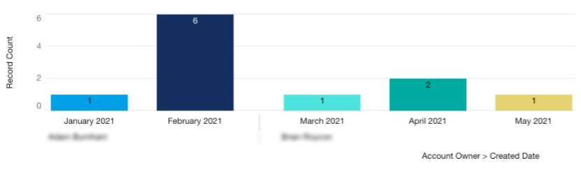
Number of Records Created Reports
We can use any object in Salesforce where we want to ensure that our users are creating records relevant to their role in the business. Are we creating enough Leads to sustain our pipeline, do we have enough support staff to answer the number of inbound cases we are receiving, is work balanced between team members, and of course – are all our members of the team using Salesforce as it was designed. All these questions can be answered by tracking the number of records being created in our system.
For this example, I’ll use the Accounts object but the same process would apply to other objects. I used an Accounts Report Type to create this report.
We can group by record Owner (or ‘Created by’ if ownership of records changes at your company) AND Created Date. This allows us to see both who created it and by a specific time frame. Note in the screenshot above that we can ‘Group Date By…’ to define the time frame we want our records to be sorted.
In these types of reports, it can be useful to add a chart to the report (if we use the report on a dashboard just check ‘Use chart settings from report’ checkbox while editing the component). We gain a quick visual of our report from the report itself

Conclusion
I’ve already linked you to my most recent blog but I’d also like to call attention to the first post in this series on ways to Increase Adoption in Salesforce – 5 Tactics. In that blog, in Tips #2 and 4, I highlight the importance of collecting feedback and the focus on continuous improvement. We need to gain an understanding of what is going well and what isn’t. After creating these reports, if we find that we aren’t seeing the adoption number we were hoping for, we need to know why!
Send out a survey (or use Chatter) to get direct feedback from users on different pain points and ensure you are hitting your business objectives. This is an excellent way to gain a quick understanding of where you need to make your adjustments so our users feel engaged in the process from start to finish and we gain that buy-in from the top down.